|
|
Post by illwauk on Jan 23, 2012 12:10:20 GMT -6
Panthers can work locally, but not out-state. Out there, people are more likely to think "Carolina" upon seeing Panthers (thanks to Wisconsin's biggest obsession being the local NFL club) and "Brewers" upon seeing Milwaukee. In other words, the website for a Milwaukee-based source (such as the jsonline), could list PANTHERS alongside PACKERS, BREWERS and BADGERS, but that wouldn't work for a source in a Madison or an Eau Claire. Obviously "MILWAUKEE" wouldn't work in that situation either and you can forget about "UWM" (lest people be confused as to why UW-Madison is listed twice). Hence, we get stuck with UW-Milwaukee again and we're back at square one. In short, we can adopt a secondary brand (such as UMilwaukee and/or UMil) or an "ownable" nickname (such as Black Gulls)... those are pretty much our only options. illwauk, I respect and understand the undperpinnings of your ideas, but I stilll think MILWAUKEE and MILWAUKEE PANTHERS are the best way to go. LSU has alternative references (what is it- the Cajun Tigers or Ragin' Cajuns whatever?), and maybe that will work. I guess my disapointment is that, the more we try to splinter our brand and divide this brand issue, the bigger the problem becomes. Milwaukee Panthers - who just so happen to play ball for the University of Wisconsin at Milwaukee. What's so wrong with "Milwaukee" or "Milwaukee Panthers"? I think that is the brand the AD and the Uni need to push. "UMil Panthers"? "Milwaukee Black Gulls"? Oh my. I understand, and I know you are creative as all get out, but please- let's "coalesce around", and not diverge from what is slowly but surely emerging as a bona-fide brand. Now if only uwmpanthers.com and jsonline.com would catch the drift..... PS: Has anyone else noticed that Wisconsin's AD site URL is "uwbadgers.com"? There is a significant difference between an internet URL and a brand. I think Jimmy hit the nail on the head, but for the sake of clarity, let me just say I 100% agree that Milwaukee Panthers is the brand we should be trying to sell at the moment, the near future and hopefully forever. If we can successfully sell Milwaukee, there's no reason to get rid of the Panthers name for Gulls or anything else. As Jimmy said, the goal of a "UMilwaukee" or "UMil" would be to extend the Milwaukee brand in places where it'd be too confusing to sell "Milwaukee" such as the sports sections of Wisconsin news websites. Sure, it'd be nice if they could use "Panthers"when that's the case, but because there's usually at least a handful of high schools in every area that are also known as the Panthers (something that's much less of a problem with a name like "Badgers"), it's impractical for most sources to do so. When the easiest thing for media outlets (such as the J-S) to use is "UW-Milwaukee," that's exactly what they'll do as long as we don't give them a viable alternative... regardless of what we, the AD, or anyone else at the university has to say about it. |
|
|
|
Post by illwauk on Jan 23, 2012 19:38:39 GMT -6
So, I think I figured out a way to change our name to University of Milwaukee and still keep the "important" UW branding.  |
|
|
|
Post by illwauk on Feb 3, 2012 15:25:47 GMT -6
The first paragraph of this article (about the disgusting things a bunch of low-rent bigots at Parkside have been doing) is a great example of the points a few people (including myself) have been making throughout the thread. I get the supposed advantages of the UW naming convention, but when it becomes necessary to explain them at the beginning of an article of this nature, it's a pretty good sign that something needs to change. www.dailykos.com/story/2012/02/03/1061485/-Nooses-Found-at-Wisconsin-Campus |
|
|
|
Post by PantherU on Feb 3, 2012 15:59:41 GMT -6
The first paragraph of this article (about the disgusting things a bunch of low-rent bigots at Parkside have been doing) is a great example of the points a few people (including myself) have been making throughout the thread. I get the supposed advantages of the UW naming convention, but when it becomes necessary to explain them at the beginning of an article of this nature, it's a pretty good sign that something needs to change. www.dailykos.com/story/2012/02/03/1061485/-Nooses-Found-at-Wisconsin-Campus+1,000,000 |
|
|
|
Post by illwauk on Feb 12, 2012 11:18:03 GMT -6
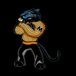
I actually like the upper one better. It's more plain, but add the claw marks to it and/or give it that same curve you gave the lower one and that gets taken care of. The lower one is too much like the Michigan/Missouri M. Mizzou also shares a very similar cat head logo as Milwaukee to further complicate it. The top one is more unique, more Milwaukee imo as it's already the M from the UWM logo. I'm digging this up because I came across something relevant to it this morning. www.columbiatribune.com/weblogs/behind-the-stripes/2012/feb/09/record-crowd-gathers-for-recruiting-reception/I'd say that pretty much solves the problem with us having a block letter. Lets return the favor and ditch our big-cat-in-an-oval mark and start basing our identity around that gorgeous "Standing Pounce" logo. |
|
Rawls
Junior
   Everyone's Entitled To My Opinion
|
Post by Rawls on Feb 12, 2012 15:01:39 GMT -6
Interesting. I prefer the panther prowling around our current M better as a primary logo. Again, add some claw marks to make it less generic. I like an 'M' logo as our primary one to drive the name 'Milwaukee' home as the name of the program.
|
|
|
|
Post by illwauk on Feb 13, 2012 12:06:01 GMT -6
Interesting. I prefer the panther prowling around our current M better as a primary logo. Again, add some claw marks to make it less generic. I like an 'M' logo as our primary one to drive the name 'Milwaukee' home as the name of the program. The problem with the current M is that it's more of an upside down W than an actual M. The slanted angles of the M's legs make claw marks very hard to execute as they either force the marks to slant downward or force them them to all be different sizes... neither of which looks very good. I'd post the version I tried if not for my laptop (where I had the file stored) dying on me. Perhaps someone whose more talented than me could find a way to make it work, but I'd rather the athletic department use a different M altogether since I've never been a fan of academic marks being used for athletics (and vice versa). |
|
|
|
Post by PantherU on Feb 13, 2012 12:59:43 GMT -6
since I've never been a fan of academic marks being used for athletics (and vice versa). This is very important. If the university is going to remain UWM, which most of us think is best, than the athletics marks need to be separate completely and can't just "borrow from the wordmark." The other reason I don't like the M from the wordmark? It's sooooo plain. Isn't this something out of Microsoft Word, like Helvetica or Arial or another lame font? |
|
Rawls
Junior
   Everyone's Entitled To My Opinion
|
Post by Rawls on Feb 13, 2012 17:32:57 GMT -6
I'm far from set on the 'woodmark' M, but I think it's more unique then a block M. Take your avatar, ilwauk. It's a block M with a curve and claw marks added. You say the claw marks would look bad on the current M, but when have claw marks been neat and tidy? Also as I said earlier in the thread, tweak it. Add the same curve to it, italicize it, give it a shadow. Just throwing things out there.
I also disagree that the woodmark M, without the UW prefix would effect or identity problems. Those start being solved when our own athletic department sees it as a priority.
It's too bad the Monster energy drink has it's current logo. I think that'd fit us amazingly well.
|
|
|
|
Post by PantherU on Feb 13, 2012 22:45:10 GMT -6
It's too bad the Monster energy drink has it's current logo. I think that'd fit us amazingly well. Charlie what-now?  |
|
Rawls
Junior
   Everyone's Entitled To My Opinion
|
Post by Rawls on Feb 14, 2012 13:18:37 GMT -6
It's too bad the Monster energy drink has it's current logo. I think that'd fit us amazingly well. Charlie what-now?  Huh? Don't get the reference, sorry. |
|
|
|
Post by illwauk on Feb 14, 2012 15:09:03 GMT -6
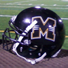
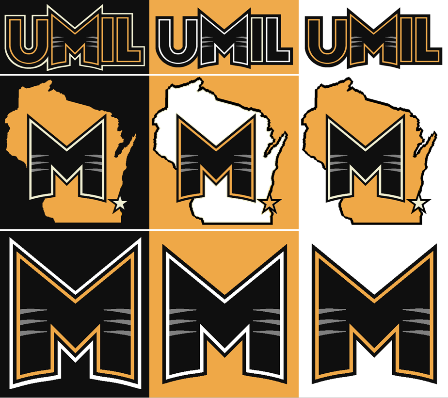
I'm far from set on the 'woodmark' M, but I think it's more unique then a block M. Take your avatar, ilwauk. It's a block M with a curve and claw marks added. You say the claw marks would look bad on the current M, but when have claw marks been neat and tidy? Also as I said earlier in the thread, tweak it. Add the same curve to it, italicize it, give it a shadow. Just throwing things out there. I did try something like this, but I don't think it's as strong by itself without the serifs. It could also be the mark a minor league baseball team as much as it could be for a college. I prefer the block version because it looks more... well... collegiate.  I also disagree that the woodmark M, without the UW prefix would effect or identity problems. Those start being solved when our own athletic department sees it as a priority. It's too bad the Monster energy drink has it's current logo. I think that'd fit us amazingly well.Jagged claw marks like what you're suggesting would likely be hell to embroider. That's why realistic art rarely makes for good logos. Logos are used on a variety of mediums from t-shirts, to billboards to actual uniforms and therefore, have to be equally and easily printable, screen press-able, paint-able or embroider-able. This is a huge issue with our current logo as there's no way to effectively embroider all the gradients and therefore, most of the hats bearing the oval-panther look like crap. Case in point: www.amazon.com/gp/product/B000S9N4YW/ref=pd_lpo_k2_dp_sr_1/190-3489791-4093168?pf_rd_m=ATVPDKIKX0DER&pf_rd_s=lpo-top-stripe-1&pf_rd_r=1462Y58ZWG2XMQ6A9ET1&pf_rd_t=201&pf_rd_p=486539851&pf_rd_i=B005ZEK5II(Unfortunately, this isn't anything close to the first time I've seen Panther merch in blue thanks to those damned gradients and the manufacturer not knowing any better... but I digress.) The best college logos (or any sports logos, really) are not only simple enough that child can draw them from memory, but distinctive enough to be able to freely associate them with the team they represent. By no means am I trying to say my logo is perfect, but I take pride in knowing that even people who pay little to no attention to Panther athletics have been able to identify it as a Panthers logo. |
|
|
|
Post by illwauk on Feb 14, 2012 15:16:01 GMT -6
Speaking of separate athletic and academic identities, here's an article about a decision in Boulder. While I think banning food-service workers from wearing the logo is a bit much, Colorado... one of the best public universities in the country... clearly understands the need to keep separate identities for academics and athletics. www.dailycamera.com/cu-news/ci_19940267FYI, Madison has a similar policy concerning the use of Bucky (not sure about the motion-W though). |
|
Rawls
Junior
   Everyone's Entitled To My Opinion
|
Post by Rawls on Feb 14, 2012 16:29:37 GMT -6
I like those, ilwauk! Maybe play around with other effects, but I like that better than the woodmark M or your previous logo. Just my opinion. Also, I still think UMil adds to our brand confusion rather than helps it. At least unless/until we become the University of Milwaukee. I agree the block M looks more collegiate, that's why Michigan, Missouri, Mississippi, Marshall, etc use it. This one would be uniquely Milwaukee - a strength in my book.
|
|
|
|
Post by PowerCrazy on Feb 14, 2012 23:12:11 GMT -6
I really like the logo with the "M" in front of WI, I feel that would be a great way to separate us from other M teams
|
|
