[Redesign Concept] Let's Go Back to the Golden Ages
Nov 26, 2020 20:27:04 GMT -6
bringbackpearsefield likes this
Post by bringbackpearsefield on Nov 26, 2020 20:27:04 GMT -6
Hello everyone - you likely don't know who I am; that's fine. All you need to know is that I am currently a second year design student here at UWM/UMKE/MKE/UMil/UofM. I firmly believe that we have a naming issue, an identity crisis, a funding problem, and a lack of student support. Over the past couple years, I have done extensive research on previous looks, logos, designs, campus architecture, and more. I truly believe that if we want a look that is distinctly ours that is timeless, embedded with tradition and history; we need to look back, not forward. In doing so I have refreshed and modernized some of (in my opinion) best logos and designs in the history of our university. I have combined these to create a cohesive brand identity that channels the best of our distinct past into a forward looking design system.
Colors wise - I think we need a slight different shade of Gold. All of these designs feature a gold marked #fcae02. Furthermore, I also think we need to include CREAM as our alternate/third color in addition to Black and Gold. We are the cream city, and cream is just a lighter shade of gold if you really think of it.
First off; the "M". Some of our old "M" logos are too similar to Minnesota, or Michigan - two nearby schools who use sole "M" logos as well in a university capacity. This is our most important identity, and must be DISTINCT. That is why I chose the script M found in these archive photos: Ref Photo 1 Ref Photo 2 With those as a reference, I have refined the "Script M" to the following logo:
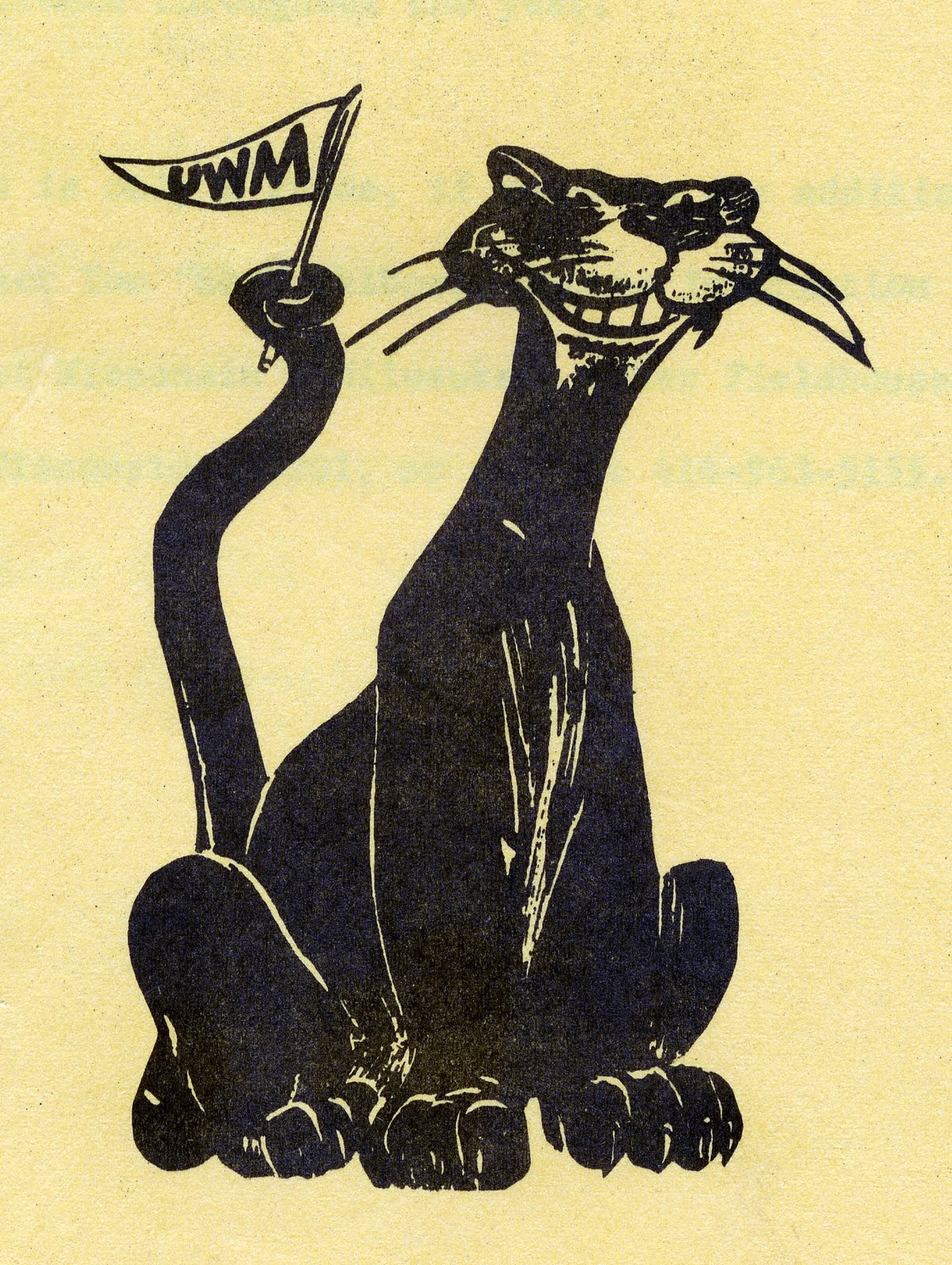
Secondly; the mascot. If you see here, a simple search of "classic university mascot logo" puts UWM in the 9th spot (at of the time posting this) (link). That is BIG. I hope others feel similarly about this logo - it is simply great (totally evokes Bucky, Sparky, and other great mascot logos). I took the liberty of cleaning it up, simplifying some aspects, and recoloring the face to better match our current mascot costume; oh and to include the "Script M" logo shown earlier.
Lastly; the Scriptmark. Given the popularity of the "Milwaukee" script seen on Milwaukee Tool, the Bucks Cream City uniforms, and the new Brewers navy jerseys - it only makes sense that we have a script "Milwaukee" that compliments the "Script M" as well. I found an old baseball jacket on eBay that I used as a rough starter - however this design I took more creative liberty. Mainly to ensure that it flows nicely with the refined "Script M". I don't think the eBay listing is still around, however here is a small screen grab that I still have on my computer for reference.
 [link]
Here is a mockup featuring some of these designs in use:
 [link]
I do not own the rights to the photographs for the players pictured. Usage is only for conceptual demonstration purposes only.
What do you all think? A new logo can revitalize the student population, which can lead to a surge in funding from merchandise and renewed interest online and in person (when the pandemic clears). It can also pave the way to new facilities, like upgrading Engelmann Stadium to something a little more football capable(? - think UCincy's Nippert Stadium), a revitalized Klotsche Arena on campus, and maybe an on-campus baseball park too.
Milwaukee be our guiding light!
Colors wise - I think we need a slight different shade of Gold. All of these designs feature a gold marked #fcae02. Furthermore, I also think we need to include CREAM as our alternate/third color in addition to Black and Gold. We are the cream city, and cream is just a lighter shade of gold if you really think of it.
First off; the "M". Some of our old "M" logos are too similar to Minnesota, or Michigan - two nearby schools who use sole "M" logos as well in a university capacity. This is our most important identity, and must be DISTINCT. That is why I chose the script M found in these archive photos: Ref Photo 1 Ref Photo 2 With those as a reference, I have refined the "Script M" to the following logo:
 [
[Secondly; the mascot. If you see here, a simple search of "classic university mascot logo" puts UWM in the 9th spot (at of the time posting this) (link). That is BIG. I hope others feel similarly about this logo - it is simply great (totally evokes Bucky, Sparky, and other great mascot logos). I took the liberty of cleaning it up, simplifying some aspects, and recoloring the face to better match our current mascot costume; oh and to include the "Script M" logo shown earlier.
 [
[Lastly; the Scriptmark. Given the popularity of the "Milwaukee" script seen on Milwaukee Tool, the Bucks Cream City uniforms, and the new Brewers navy jerseys - it only makes sense that we have a script "Milwaukee" that compliments the "Script M" as well. I found an old baseball jacket on eBay that I used as a rough starter - however this design I took more creative liberty. Mainly to ensure that it flows nicely with the refined "Script M". I don't think the eBay listing is still around, however here is a small screen grab that I still have on my computer for reference.
[link]Here is a mockup featuring some of these designs in use:
[link]I do not own the rights to the photographs for the players pictured. Usage is only for conceptual demonstration purposes only.
What do you all think? A new logo can revitalize the student population, which can lead to a surge in funding from merchandise and renewed interest online and in person (when the pandemic clears). It can also pave the way to new facilities, like upgrading Engelmann Stadium to something a little more football capable(? - think UCincy's Nippert Stadium), a revitalized Klotsche Arena on campus, and maybe an on-campus baseball park too.
Milwaukee be our guiding light!