Post by illwauk on Mar 20, 2012 14:19:48 GMT -6
Here it is...
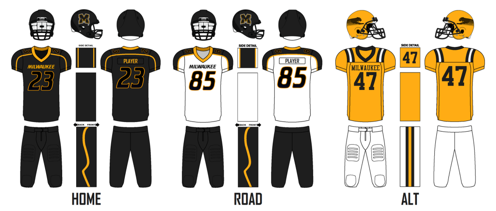
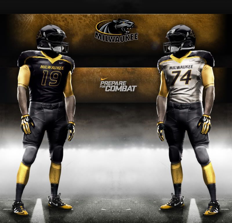
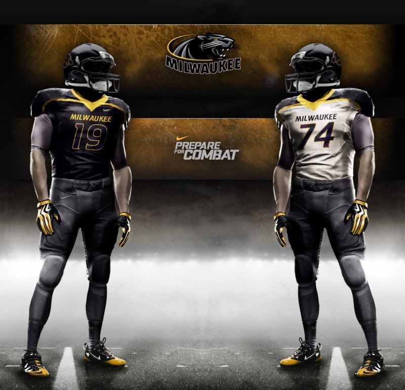
I felt that the Panthers should go ultra-modern and project a very "21st century" image to contrast with the traditional (and if you ask me, bland and generic) look of the Badgers. Here's some of the key features:
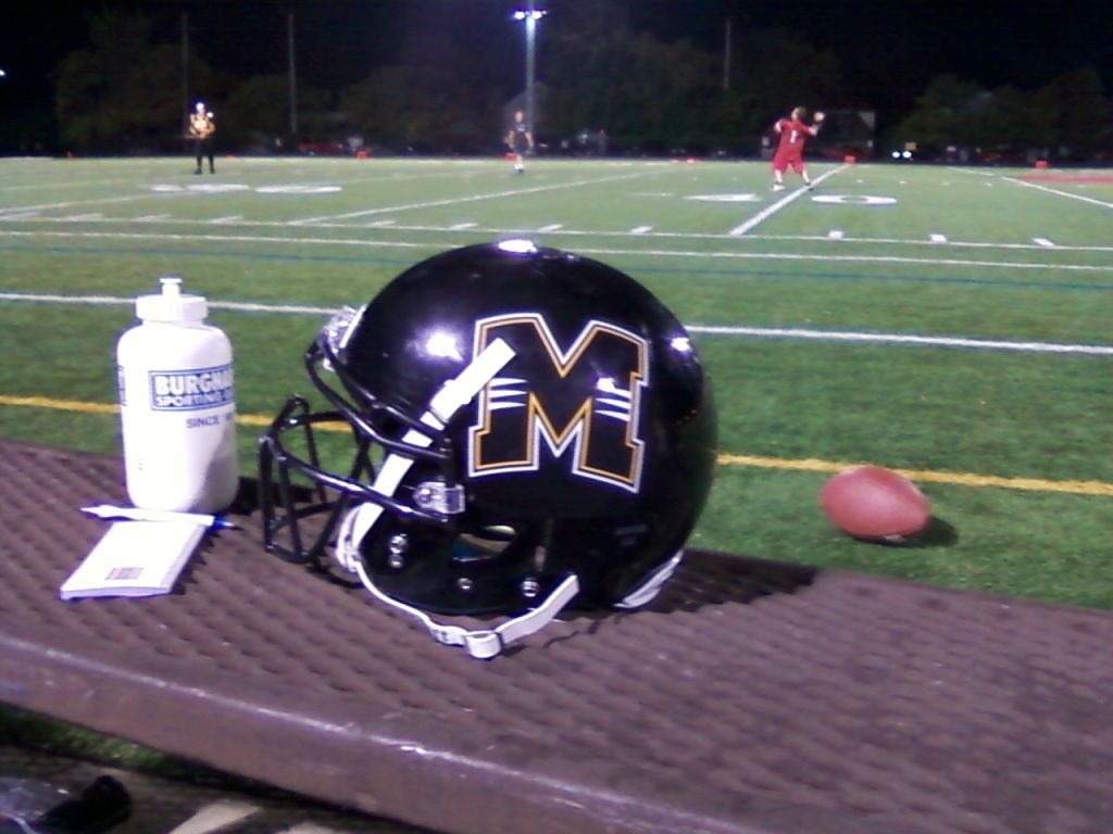
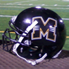
-I decided to emphasize black here since we're the only pro or D1 college in Wisconsin that uses black as a primary color. It also happens to be one of the most (if not >the< most) marketable colors in sports. Normally I'm not a huge fan of marketing and merchandising dictating what a team wears on the field, but this is one of the rare cases where it actually helps emphasize the stronger aspects of our identity, so I went with it.
-The font used for the numbers and wordmark is crillee, which I like because of its easy legibility, its sleek, modern look without being too gimmicky and most importantly, there's a historical precedent for it in Panther athletics.

-The pant stripe simulates the outline of a real-life panthers' hind leg. I figured that would look especially good on linesmen crouched down in a 3-point stance.
-You may have to bump up the contrast on your computers to see the subtle gradient and/or use your imagination for this, but the numbers are meant to be an iridescent material similar to what Oregon used in the Rose Bowl, only these are meant to simulate the coat of a panther rather than the down of a duck. It has the added bonus of finally giving some meaning to the blue gradients that have plagued our athletic identity for so long (I still hate gradients in logos though).
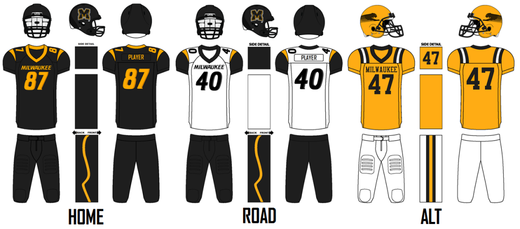
-The alternate is an attempt to connect what would be the current Panther football program to the 75 years of tradition it had built up before shutting down. The Panthers wore gold home jerseys for their last two football seasons, a practice (gold at home) that I wouldn't mind seeing adopted throughout the athletic department...
...the only problem with bringing this back en masse is that it's just too generic. It could just as easily be used by a D3 school that shares our colors and therefore, does not help build our brand. My idea spawned from noticing that the Panther logo from the 1980s just begs to be used on a helmet, yet it never happened. I paired it with uniforms that wouldn't have looked out of place in the 80s and 90s to sort of "fill the gap" during the time when the program was on hiatus. It also give a more traditional option for fans who might find the primary uniforms too ambitious and prefer a more classic look... and judging by how popular Brewers throwback merchandise is compared to the modern stuff, it seems that a lot of people in our area feel this way.
I await your comments and criticism!
I felt that the Panthers should go ultra-modern and project a very "21st century" image to contrast with the traditional (and if you ask me, bland and generic) look of the Badgers. Here's some of the key features:
-I decided to emphasize black here since we're the only pro or D1 college in Wisconsin that uses black as a primary color. It also happens to be one of the most (if not >the< most) marketable colors in sports. Normally I'm not a huge fan of marketing and merchandising dictating what a team wears on the field, but this is one of the rare cases where it actually helps emphasize the stronger aspects of our identity, so I went with it.
-The font used for the numbers and wordmark is crillee, which I like because of its easy legibility, its sleek, modern look without being too gimmicky and most importantly, there's a historical precedent for it in Panther athletics.
-The pant stripe simulates the outline of a real-life panthers' hind leg. I figured that would look especially good on linesmen crouched down in a 3-point stance.
-You may have to bump up the contrast on your computers to see the subtle gradient and/or use your imagination for this, but the numbers are meant to be an iridescent material similar to what Oregon used in the Rose Bowl, only these are meant to simulate the coat of a panther rather than the down of a duck. It has the added bonus of finally giving some meaning to the blue gradients that have plagued our athletic identity for so long (I still hate gradients in logos though).
-The alternate is an attempt to connect what would be the current Panther football program to the 75 years of tradition it had built up before shutting down. The Panthers wore gold home jerseys for their last two football seasons, a practice (gold at home) that I wouldn't mind seeing adopted throughout the athletic department...
...the only problem with bringing this back en masse is that it's just too generic. It could just as easily be used by a D3 school that shares our colors and therefore, does not help build our brand. My idea spawned from noticing that the Panther logo from the 1980s just begs to be used on a helmet, yet it never happened. I paired it with uniforms that wouldn't have looked out of place in the 80s and 90s to sort of "fill the gap" during the time when the program was on hiatus. It also give a more traditional option for fans who might find the primary uniforms too ambitious and prefer a more classic look... and judging by how popular Brewers throwback merchandise is compared to the modern stuff, it seems that a lot of people in our area feel this way.
I await your comments and criticism!