|
|
Post by illwauk on Feb 9, 2012 9:50:27 GMT -6
|
|
|
|
Post by JG Panthers on Feb 9, 2012 10:08:57 GMT -6
Wow, that's huge illwauk. Congratulations on having someone recognize your talent...
|
|
kaygee
Sophomore
 Panther Pride since 1994!
|
Post by kaygee on Feb 9, 2012 18:34:07 GMT -6
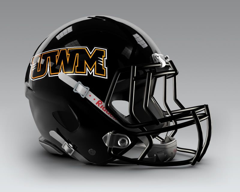
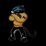
The first two designs are awesome! Not a big fan of the UWM one. I would place an order some mini helmets.
|
|
|
|
Post by illwauk on Feb 29, 2012 11:01:43 GMT -6
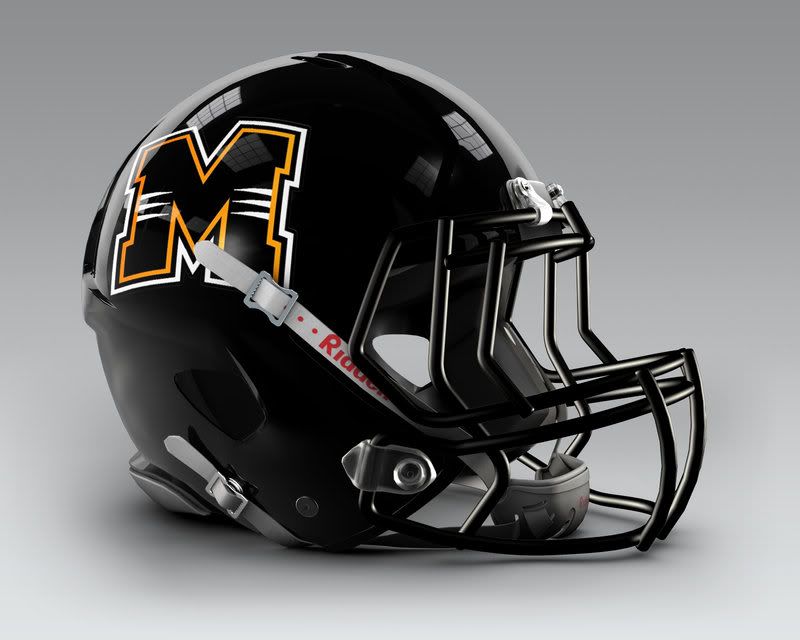
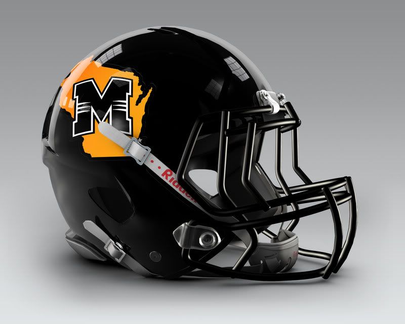
Thanks for the compliments guys. I finally heard back from Ben and apparently they're gonna go with #2 (the Wisconsin outline version).
|
|
|
|
Post by tyrunner0097 on Feb 29, 2012 23:36:31 GMT -6
Personally, I liked #1 best and would have had #2 as a shoulder patch for the uniforms...
|
|
|
|
Post by illwauk on Mar 1, 2012 8:49:48 GMT -6
That's exactly what I would've done if it were up to me, but I'm just happy to know they plan to use something that I designed. Besides, the idea of the state outline on the helmet has already started to grow on me. Not all that surprising though, since I've always loved Louisiana Tech's look. 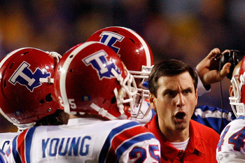 |
|
|
|
Post by gman2 on Mar 2, 2012 9:32:12 GMT -6
Do you think people may consider the M logo a Missouri ripoff? I really don't have a problem with being known as UWM and liek the UWM logo
Louisiana Tech works with the state because Louisiana looks like the letter L, plus they are Louisiana Tech, a "statewide" institution. I don't care for the M in Wisconsin, if your trying to distance yourself from association with Wisconsin by trying to be known as Milwaukee instead of UWM, why include the state of Wisconsin?
Anyway, they all do look pretty cool.
|
|
|
|
Post by illwauk on Mar 3, 2012 13:25:24 GMT -6
Do you think people may consider the M logo a Missouri ripoff? I really don't have a problem with being known as UWM and liek the UWM logo Louisiana Tech works with the state because Louisiana looks like the letter L, plus they are Louisiana Tech, a "statewide" institution. I don't care for the M in Wisconsin, if your trying to distance yourself from association with Wisconsin by trying to be known as Milwaukee instead of UWM, why include the state of Wisconsin? Milwaukee is a statewide institution... we have more Wisconsin-born students than every other school in the state including UW-Madison and our students are more likely to remain in Wisconsin after graduation. To me, that's what the state outline represents. It also helps us not be mistaken for Missouri, which I see as less of a problem now that the Tigers are phasing out their block-M for the tiger-head (apparently a survey showed that most casual fans think Mizzou's block-M is a Michigan ripoff). Speaking of which... the fact that our primary mark is a big cat in an oval certainly doesn't help matters, but since our colors, mascot and initial are all very similar, pretty much anything we come up with runs the risk of being mistaken for Missouri (and vice versa). As far as selling "UWM." I don't mind it from a strictly design point of view since those letters lend themselves to some pretty cool possibilities. 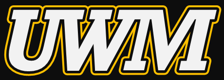 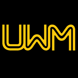 That said, selling UWM is just not practical considering most people think of UW-Madison first upon hearing "UWM" (see my latest post in the Milwaukee Brand thread for an example of this). Add that the club football team rarely (if ever) plays teams from outside of Wisconsin, it just makes more sense for them to call themselves Milwaukee. Anyway, they all do look pretty cool. Thanks! ;D |
|
|
|
Post by parkerj on Mar 3, 2012 13:55:24 GMT -6
i like the second one you just posted.
but my fave is still your avatar
|
|
|
|
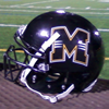
Post by illwauk on Mar 10, 2012 17:48:01 GMT -6
Just decided to do a random quick mock-up of what I think we'd be using if we had a football program right now. 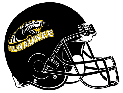 My dislike of the oval Panther aside, it's not a bad look and the logo looks like it'd translate better to a helmet than anything else its ever been put on. In general, I also prefer letters on college football helmets, but I think in our case (i.e. having probably the most generic initial-logo in D1) this would be the way to go. |
|
|
|
Post by thegreengull on Mar 11, 2012 14:23:25 GMT -6
This helmet looks very sharp, well done illwauk.
I definitely agree that in terms of the current logos used by the Athletic Department that this would be the best logo/helmet combination.
|
|
|
|
Post by thegreengull on Mar 11, 2012 15:12:28 GMT -6
In terms of uniforms, I think something similar to Southern Miss’ uniforms for the Milwaukee Panthers could be pretty neat. |
|
|
|
Post by illwauk on Mar 12, 2012 8:31:11 GMT -6
Not bad if we're gonna go with a "paint by numbers" look (which, knowing our Athletic Department, will be exactly what happens), but football would instantly become our flagship program. I would hope that the Panthers look will actually be designed... as in someone will take some time to think about the ambitions of the football program and the traditions of previous clubs (so we don't ditch 70+ years of history), then find a way to incorporate that into our uniforms.
|
|
|
|
Post by thegreengull on Mar 12, 2012 12:39:16 GMT -6
I understand your point, what do you have in mind?
|
|
|
|
Post by illwauk on Mar 12, 2012 22:14:28 GMT -6
I have something in mind... maybe I'll get a chance to work on it during break.
|
|