|
|
Post by PantherU on Sept 30, 2011 20:18:34 GMT -6
You mean something like... this? Note: I went looking for one I've seen of a gray shirt with black MILWAUKEE and gold PANTHERS underneath. It had the Adidas logo over Milwaukee and looked AWESOME. I wanted to use that as my example but as I said, I couldn't find it. |
|
|
|
Post by uwmfutbol on Sept 30, 2011 20:42:09 GMT -6
I don't like how it's faded, but yeah that's much better.
|
|
|
|
Post by illwauk on Oct 11, 2011 20:10:08 GMT -6
 Sweet Jeebus that is one fugly shirt!
|
|
|
|
Post by illwauk on Oct 11, 2011 21:08:03 GMT -6
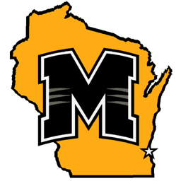
I'm not sure if I explicitly mentioned this, but I do graphic design as a hobby job. Although I mainly do concert posters, fliers, album covers, etc; I also can't help but shake my head at the branding nightmare that is my alma mater and as such, I've designed a few logos that I can honestly say are superior in almost every way to what our school is currently using... although I think that says more about how crappy our athletic identity is than my talent. ;D Either way, I figured I may as well post my ideas here. Some of these were designed using paint a few years ago and could probably stand to be cleaned up a bit, but that's not too important here. First up is my idea for a monogram. I don't know where to start with how disappointed I am that they're pushing that bland, yanked-from-the-academic-wordmark M on us when they could've gone with something that actually hints at what the school's mascot is.  |
|
|
|
Post by illwauk on Oct 11, 2011 21:11:37 GMT -6
If they INSIST on using the plain block M, I think this is the route to go. Milwaukee now has more Wisconsin-born students than any other college and should be emphasizing this in its identity package. I think this would look awesome at midcourt at the cell.  I also have a version using my logo.  |
|
|
|
Post by DunneDeal on Oct 11, 2011 22:46:44 GMT -6
I love that bottom logo..and if you dont mind I will steal it to use as avatar.
|
|
|
|
Post by illwauk on Oct 12, 2011 16:26:35 GMT -6
I love that bottom logo..and if you dont mind I will steal it to use as avatar. Thanks man... I don't mind at all! |
|
|
|
Post by PantherU on Oct 12, 2011 22:31:23 GMT -6
Oh my god that is beautiful. Send that to rickc@uwm.edu and mlovell@uwm.edu and tell them this is the direction they need to go if they really want "Milwaukee" as the brand they want to be known by.
|
|
Rawls
Junior
   Everyone's Entitled To My Opinion
|
Post by Rawls on Oct 13, 2011 16:51:27 GMT -6
I actually like the upper one better. It's more plain, but add the claw marks to it and/or give it that same curve you gave the lower one and that gets taken care of. The lower one is too much like the Michigan/Missouri M. Mizzou also shares a very similar cat head logo as Milwaukee to further complicate it. The top one is more unique, more Milwaukee imo as it's already the M from the UWM logo.
|
|
|
|
Post by illwauk on Oct 13, 2011 20:37:52 GMT -6
I thought of Mizzou when I looked at this before posting it. Unfortunately, that's a side-effect of sharing an initial on top of similar colors and mascots. I have a couple other ideas brewing in my head that I may toy with if I have some time, but one way we could differentiate ourselves from Mizzou (and something I wish we would actually do) is retire the panther-head and make "Buck E. Panther" the primary logo.
But the Mizzou issue is the main reason I think we should look into getting a new mascot... that, and the panther is a painfully generic mascot that no one takes pride in.
|
|
|
|
Post by illwauk on Nov 10, 2011 22:18:39 GMT -6
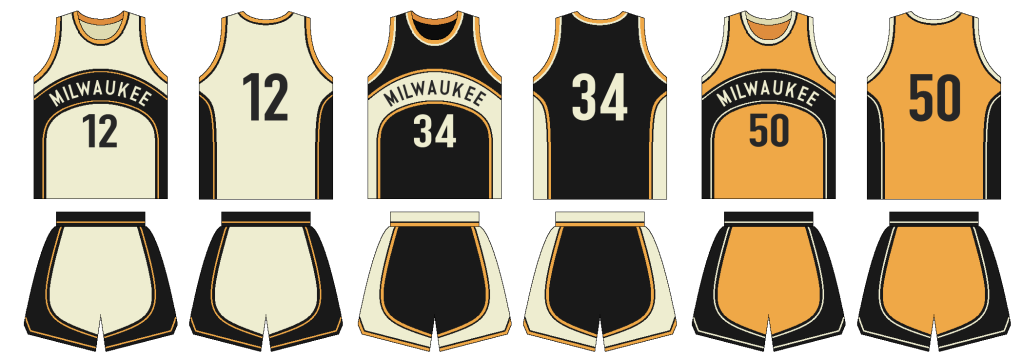
I made these because I do not like our basketball uniforms... mainly due to the clunky wordmark that already looks outdated. I tried to make an updated version of the awesome throwbacks we wore last year against Western Michigan. I also used cream instead of white because I think it's appropriate for a team that represent's "Cream City" in the college hoops world... thoughts?  |
|
|
|
Post by DunneDeal on Nov 11, 2011 9:25:25 GMT -6
I like them but I do like the ones we have now. Esp cause of the Grey home Uni's hopefully they will wear tomorrow.
Also Im not sure but I think our Adidas deal is ending soon (correct me if im wrong), and a move to Nike, or Nike Flight would be awesome!
|
|
|
|
Post by illwauk on Nov 12, 2011 17:30:20 GMT -6
I've only seen one picture of the home unis... I thought the grey was actually the result of a bad cam-phone pic. Pretty cool if they really are gray, but I feel like cream goes just as well with black & gold and would help drive home the idea that the Panthers' are a Milwaukee team (opposed to just the university's team).
|
|
|
|
Post by PantherU on Nov 15, 2011 13:03:19 GMT -6
Comment on the ESPN column on Cleveland State:
PJCinAlbany
This outcome is really not that surprising.
1. The Horizon League has been way underrated for a while (maybe its all the hyphenated school-names?). Butler's been to back-to-back National Championship games (3rd most NCAA wins in last 5 yrs behind NC and Kansas), and only managed a 3-way tie for regular Season Horizon Champs last year. They are challenged every game, and not infrequently beaten in-Conference. And Cleve St. will challenge for the Horizon again this year.
2. Vandy continues to be way Overrated. Every year we hear about how great they're going to be, then they play a little above .500 in conference, get an at-large and get eliminated in the first round. Pre-season Top-10? Pulleeeze, stop it.
|
|
|
|
Post by tyrunner0097 on Dec 12, 2011 16:11:22 GMT -6
Taped the Tuesday episode of Sports 32 Roundtable today, and I thanked Dennis Krause for him going out of his way to say, "MILWAUKEE Panthers" and being adament about the team being called such.
|
|